Hello!
Lately I've been struggling with many problems, such as my financial situation etc. I wanted to put off the frustration out of my brain.
Therefore, I decided to make the design for that, and hopefully as my design goes off from my mind, the frustration also comes out there.
Working process below from the 1st to the final
1.
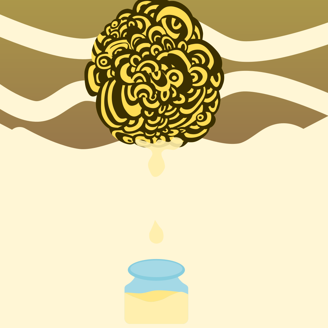
2. Honey dropping from a nest into a jar
3. Sizing the items, and trying to find the best position
4. Putting the theme, "When LIFE gives you a bee nest, you squeeze the HONEY out of it."
Also putting the camouflage pattern in the background.
5. Deciding the best color
6. The final
Removed the jar, and honey dripping from the bee nest.
And made the size of the nest bigger, trying to fit in the pattern in the background nicely.
The reason why I made the text hard to read:
A general idea for problem can be sometimes hard to read, or understand, but you know it is right in front of you. I wanted to express that vague part of a problem in this design.
Thank you for reading this blog.
It would be wonderful if you went to my Instagram page, and give a Like! :)
Hello!!
How are you doing? Hope you are designing, and hustling hard!
I did made a new profile picture for my SNS account, and today I'd like to share the process of making it!
Recently I watched the video of a youtuber rebranding her SNS profile picture, and etc.
It was so good that I thought it would be a great idea to do it myself too. ( Also because I was using a picture of me eating Korean BBQ. So professional amirite? :))
Anyway, let's get started!
First : the theme
I started to think about what I wanted in my profile picture. Then those words showed up in my note.
The new profile should be something people feel fun from, but also should think I'm a professional designer at the same time.
First thing I did was to pull up the old profiles, and decided which portrait of mine was going to be used.
First, Logo.
I call this logo "taku logo." ( Very original!)
I used to use this logo that I made a year ago (before using a picture of me eating Korean BBQ,) and wanted this image to be incorporated into the new profile somehow.
Then, my portrait picture.
This was taken before I came to Australia by a talented friend of mine.
Those below are me struggling with how to put the logo, and the portrait into the one design.
After those some trial, I was stuck. There was no way I could make something better from those ideas. I knew those ideas in the first place was too weak to build up the design; therefore, I went back to question myself again.
"How do you see yourself now?"
"What are you trying to make?"
This turned out to be a great idea.
The ideas that I came up with:
I came up with the image of the running cheetah. I compare myself with the cheetah chasing after a deer, and thought it somehow had the similarity with me chasing my dream with becoming a professional graphic designer.
While I was working on this, I was watching Pewdiepie's video, and his profile picture caught my eye.
The idea of hiding the part of the face with something was very new, and fresh idea for me. I knew it had to be in my profile too.
With those ideas, I was still struggling a lot as you can see below.
After some time where I became exhausted, I came to the conclusion that the old logo was being obstacle to finish the project.
The process became very fast from there.
I drew my portrait of mine, and put a box on it. (Inspired by Pewdiepie)
For the letter, "TAK"
I tried several versions of them, and picked this one below. (Chosen one is circled. )
After adjusting the balance, and color, it turned out to be so good that I was very proud of that I got to use it from now on.
If you would like to see more of my design, there are lots more on my Instagram page :)
It would be great if you could follow me, or give me like!!
Hello, everyone! This is Tak. I've been busy lately. I recently moved into Australia, and am hustling everyday!! Anyway, enough with my daily life. Let's move to the design talking :) Today's design's Title: DO YOU SEE WHAT I SEE? As I talked about it a little bit above, I moved in Australia, and the night sky was beautiful here that it inspired me to make this design that I'm going to introduce today. (Wanted to put a picture, but have only smartphone's camera :( ) 1. THE THEME IN THIS DESIGN The stars in the night are so beautiful that as if I stared at them long enough, I could fall "down" into the sky. This above is the big idea. I wanted to capture the idea of the falling down into the deeply, and getting lost into the far sky which were full of stars. Also when I watch them, I can't help but imagining someone I miss on the other side of the earth. Therefore, the themes in this design were decided to be "falling down into the sky," and "connection over the globe." 2. SCRIPT ON NOTEBOOK This was the first idea. "The girl falling down in the universe."
To find what I'm looking for, brainstorming kept going on. Those are the ideas that came up to my mind. THE GIRL IN THE OCEAN I thought it would be interesting idea to give the light from the surface of the ocean reaching to the girl. BUT "lack of stars," soooo saved it for the other design I will make in the future.
THE BALLERINA UNDER THE NIGHT SKY This was the idea where a ballerina danced under the sky filled with the night stars. The idea was nice, but I thought I kind of saw this thing recently. (La La... cough Land cough...) Also there wasn't any expression of "falling down."
After those ideas, there were some I came up with, but all of them didn't have much potential. Then, I decided to go back to the first idea, and see where it could bring me. The next thing I saw was this below. The core idea is the same, but clearer, and specific. The girl was moved to the right bottom, and gave the feeling of falling in more, and by drawing the circle, the design gave the idea of "the girl is moving out of the world she used to be," and "the connection" that I talked about in the first place in this blog.
When I drew this on the notebook, I knew I was ready to go on laptop. To find the item which is going to be the foundation for this design, I went to Google. And I found this item, and decided to build up my design from there.
Then for the girl, I put the image of an astronaut just to have an idea of composition in the design. put the girl, and letters which were "DO YOU SEE WHAT I SEE?" as it is the theme here. Also I noticed that the design was too flat, (if too flat, it doesn't give you the feeling of falling down) so I added the depth there by duplicating each items.
Next thing is about the girl falling down. One girl is not big enough to give an impression to the viewers, so I duplicated the girls, laid them in a row, and dropped from the top to the bottom in the center. pic.1 (I've tried other angles for how the girl fell.(picture below .2 .3)
pic.1
pic. 2
pic. 3
The sentence " DO YOU SEE WHAT I SEE?" was too straight forward to the audiences, so I slipped the girls between the layer of the words, and made it a little harder to read the sentence. After those processes, I came up with the idea where I put the white frame around this design, and gave the stronger idea of the girl falling from the top to the bottom. But then, it didn't keep the balance well for my perspective. I will share it with these images too in case you're interested in :)
This is my Instagram page. If you like this post, please give a big like, and hopefully subscribe too. I'll keep making those, and would love to share with you!
This time as well, I'm going to show you what I designed, and its process of creating it here.
The theme for this design I'm about to show you is " Greed."
First, the direction, and core idea for this design were decided by mapping the several ideas.
I connected those ideas in the picture above by associating with the words from "greed."
Then I marked the ideas that I liked, so that I can look back later when I'm lost in making it.
I'm concerned that you might not be able to see the picture clearly, so here are the words that will be the core idea for the design.
make an effort → craziness
focus → make it very clear → black and white → black swan → ballet
→ 007: James Bond → Gun → Blood
Then I made those designs based on the ideas above.
(starts from up left to the right bottom)
It finally feels good when I made the design where the ballerina is put on the spot light, and there is audience.
Then I started the process on the laptop.
The first thing which came up was this.
Just in case you're wondering, the inspiration for the chair comes from Palsis Garnier, which is an opera house in Paris, France.
( I just found it beautiful on Google. There is no particular reason.)
Next thing I did was to blurred the thing around the person sitting in the centre in order to express the sense of immersion.
Also I thought that it would be a little strange if there was only one person watching the ballet concert, so I put more people there. ( In addition to it, I can blur the people, so that there will be more sense of immersion.)
It's getting there...
From this point, I need to do several adjustments.
- I made a white stroke thinner from the bottom to the up.
- Also the blurring is added more, and more as it goes up from the bottom.
- The white stroke of the chair in the center cut in the middle to express the sense of the immersion more.
- I moved things in the design to adjust the balance of the location.
Then this came up.
I felt that it was almost there, but I knew there was something missing to make it complete.
I was looking for a way to express the craziness. ( the word that I came up with when mapping.)
This was the note below where I struggled with how to put the idea of craziness in the design.
Putting something floating, zig zag pattern around the person in the centre, or those below were the ideas that I thought would be good.
By putting the lines in the random locations, I thought that it would describe the immersion somehow. Although those ideas turned out to be not great.
While thinking of how to do it, somehow I thought that it would be great to try out the Instagram's filter. And it turned out to be great!
I'm satisfied with how it is.
There are other designs that I did on my Instagram page. It would be great if you check them out.
If you enjoy this, please like this, or follow me. It helps me a lot to keep going.
Today, I'd like to go through my process of making a design for Empire State Building.
Let's get started!
First, I came up with this idea below.
It's safe to say that one of the most famous for New York is Empire State Building, and I wanted to put it in my next design.
Therefore, I put Empire, and other buildings, and traffic road circling around those buildings.
You can see it up in the picture I put above.
Also there are several kinds of cars running on the road. (Picture below)
For the final form, the blueish light, and huge "New York" are put in.
BUT it turned out that this wasn't really good I thought it would be.
So I decided to make the completely new design from scratch.
The thing I wanted to keep was simplicity, and Empire State Building.
Considering those, this came up in mind.
The very close-up image of Empire State Building, and Golden ratio.
For those of you who don't know what Golden ratio is, Google explains below.
Here you are. To make it simple, by using this, the design looks nicer than the one without it.
After some attempts, the basic line is finished.
Next, color.
Those are the pictures inspiring color.
The first one is from the game called "ABUZ."
The second one is from the random picture I found on Google.
By putting those colours in, and doing a little adjustment, it looks like this.
This came very real to a point where I wanted it to be.
This took 30 hours for me to finish this.
I put my Instagram page. It would be great if you could give me Like, or comment. It encourages me to keep going.
This is Tak who's a graphic designer for a hobby for now.
And I decided to make this diary, thinking this may help me, and others to understand how to come up with ideas, compose them, and finish the product.
With that being said, let's get started!
This time I made a poster for La La Land.
First idea looks like this below.
This is the famous cut from the movie, where Sebastian, and Mia dances together for the first time.
I wanted to make a poster from this cut, making this image very simple by using circles to draw everything in it.
It didn't work out much, and also I thought this cut only didn't do enough job.
So the next idea was to put together the scenes which was impressive for me during the movie.
In the picture above, I listed up the scenes from the movie, and decided to put which scenes in which part.
Next, detail on those pictures.
< Up Left >
< Up Right >
< Down Left >
< Down Right >
For background for those images above, I put the circles there, making it simple, and more LA-ish.
Next thing is colour.
The inspiration of the colour for those image came from those those.
Bunch of umbrellas for the scene where Mia, and Sebastian are talking at the cafe
Backpack for the scene where Mia is singing at the audition
A umbrella for the scene where Sebastian is singing on the bride
And when all those come in together, it looks like this.
I'm not sure if I did a good job explaining the process of finishing this graphic art, but I hope you enjoy this blog.
If you enjoy reading, or want to read something more like this article, please give me a Like or a comment on this blog, or my Instagram feed. It encourages me to keep posting a lot.


