Hello!
Lately I've been struggling with many problems, such as my financial situation etc. I wanted to put off the frustration out of my brain.
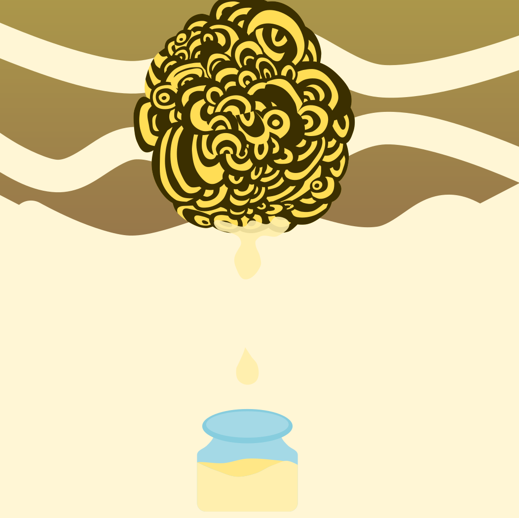
Therefore, I decided to make the design for that, and hopefully as my design goes off from my mind, the frustration also comes out there.
Working process below from the 1st to the final
1.
2. Honey dropping from a nest into a jar
3. Sizing the items, and trying to find the best position
4. Putting the theme, "When LIFE gives you a bee nest, you squeeze the HONEY out of it."
Also putting the camouflage pattern in the background.
5. Deciding the best color
6. The final
Removed the jar, and honey dripping from the bee nest.
And made the size of the nest bigger, trying to fit in the pattern in the background nicely.
The reason why I made the text hard to read:
A general idea for problem can be sometimes hard to read, or understand, but you know it is right in front of you. I wanted to express that vague part of a problem in this design.
Thank you for reading this blog.
It would be wonderful if you went to my Instagram page, and give a Like! :)
Hello!!
How are you doing? Hope you are designing, and hustling hard!
I did made a new profile picture for my SNS account, and today I'd like to share the process of making it!
Recently I watched the video of a youtuber rebranding her SNS profile picture, and etc.
It was so good that I thought it would be a great idea to do it myself too. ( Also because I was using a picture of me eating Korean BBQ. So professional amirite? :))
Anyway, let's get started!
First : the theme
I started to think about what I wanted in my profile picture. Then those words showed up in my note.
The new profile should be something people feel fun from, but also should think I'm a professional designer at the same time.
First thing I did was to pull up the old profiles, and decided which portrait of mine was going to be used.
First, Logo.
I call this logo "taku logo." ( Very original!)
I used to use this logo that I made a year ago (before using a picture of me eating Korean BBQ,) and wanted this image to be incorporated into the new profile somehow.
Then, my portrait picture.
This was taken before I came to Australia by a talented friend of mine.
Those below are me struggling with how to put the logo, and the portrait into the one design.
After those some trial, I was stuck. There was no way I could make something better from those ideas. I knew those ideas in the first place was too weak to build up the design; therefore, I went back to question myself again.
"How do you see yourself now?"
"What are you trying to make?"
This turned out to be a great idea.
The ideas that I came up with:
I came up with the image of the running cheetah. I compare myself with the cheetah chasing after a deer, and thought it somehow had the similarity with me chasing my dream with becoming a professional graphic designer.
While I was working on this, I was watching Pewdiepie's video, and his profile picture caught my eye.
The idea of hiding the part of the face with something was very new, and fresh idea for me. I knew it had to be in my profile too.
With those ideas, I was still struggling a lot as you can see below.
After some time where I became exhausted, I came to the conclusion that the old logo was being obstacle to finish the project.
The process became very fast from there.
I drew my portrait of mine, and put a box on it. (Inspired by Pewdiepie)
For the letter, "TAK"
I tried several versions of them, and picked this one below. (Chosen one is circled. )
After adjusting the balance, and color, it turned out to be so good that I was very proud of that I got to use it from now on.
If you would like to see more of my design, there are lots more on my Instagram page :)
It would be great if you could follow me, or give me like!!